A compliance score doesn't teach anything if no one understands what they passed.
The stakes
AudioEye's SEO strategist flagged a pattern, search volume around color contrast was high, but most of what ranked was either too technical or too shallow to actually change behavior. The real issue was timing. Designers weren't checking contrast during design, they were finding out it failed after launch, usually from a complaint. AudioEye saw a chance to close that gap twice over, explain what color contrast actually is and why it matters, and build a tool that made checking it part of the design process instead of a fire drill after the fact.

The solution
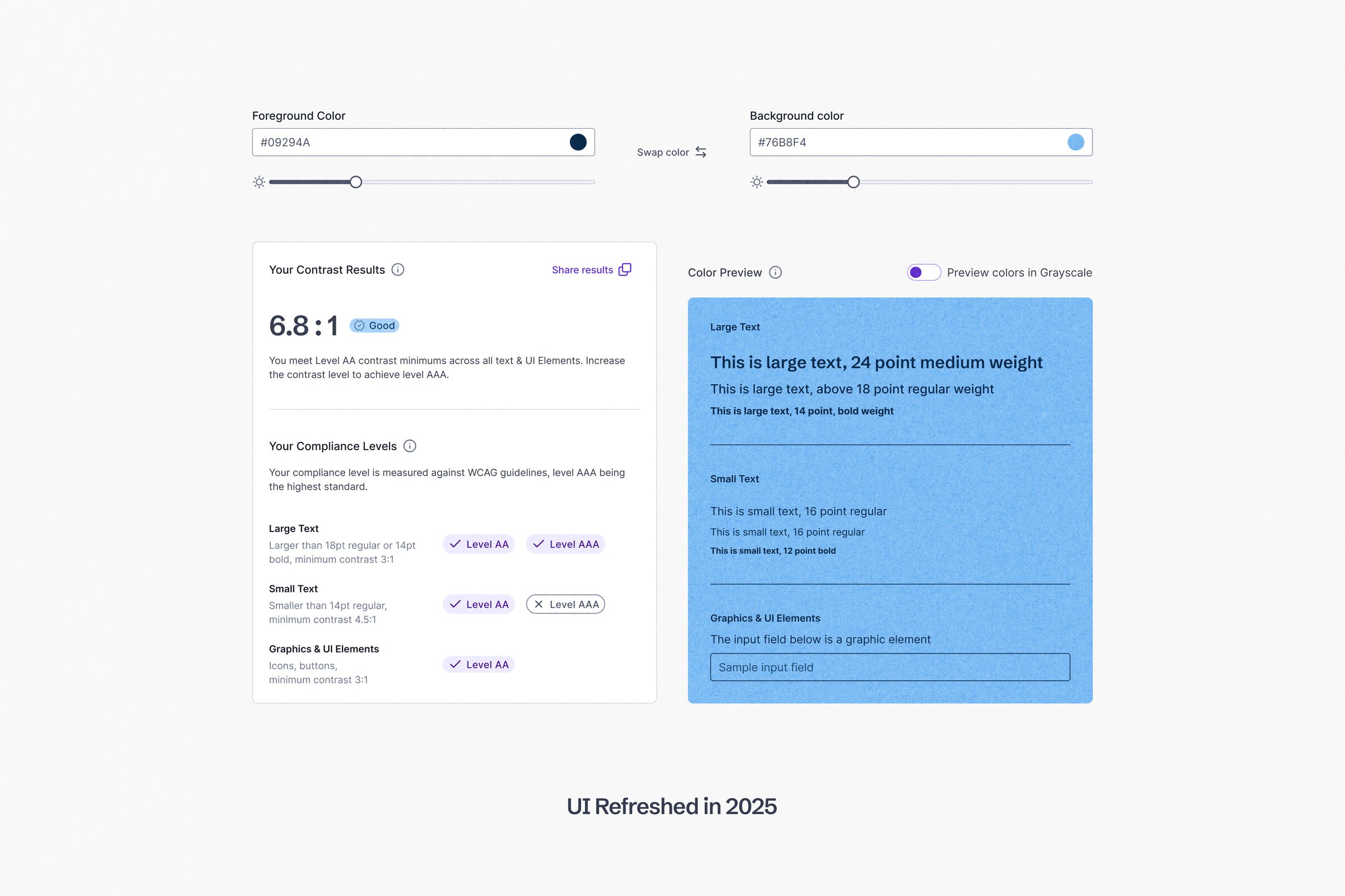
We aligned on three goals. Explain the AA and AAA distinction clearly, visualize the compliance scale without leaning on jargon outside the accessibility field, and surface educational context alongside the score itself.
We went through many wireframe iterations, moving from an early star rating system to a sliding scale with visual markers connecting each ratio to its compliance level. We also added a grayscale toggle, so sighted designers could preview what a low contrast choice looks like to someone with a vision impairment, and built the full experience for non-sighted and assistive technology users to use directly, not just be tested on behalf of.

The launch
To promote the tool, we built a short set of ad concepts around the same search intent that started the project. Each one paired the "bad contrast ruins good [x]" hook, web design, graphics, campaigns, etc., with a direct link back to the checker. The color combinations drew inspiration from Spotify's 2022 Wrapped campaign, known for its bold, high-saturation palette, deliberately pushed past the point of readability, so the ads practiced exactly the mistake they were calling out, then handed the viewer the tool to fix it.
My role
I served as design director and primary stakeholder on this project, setting direction and constraints for the visual designer rather than executing the interface myself. My focus was on differentiation, identifying what would set this tool apart from the six competitors we'd already ruled out as incomplete, and on content, writing the explanatory copy that helped designers understand not just their score, but what to do with it.
The results
The tool launched with full accessibility support for screen reader users and complete keyboard navigation with clear focus states, meaning non-sighted users could test contrast themselves rather than have it tested on their behalf. It shipped after prototype testing, peer review, and outside feedback from working designers.
What it changed
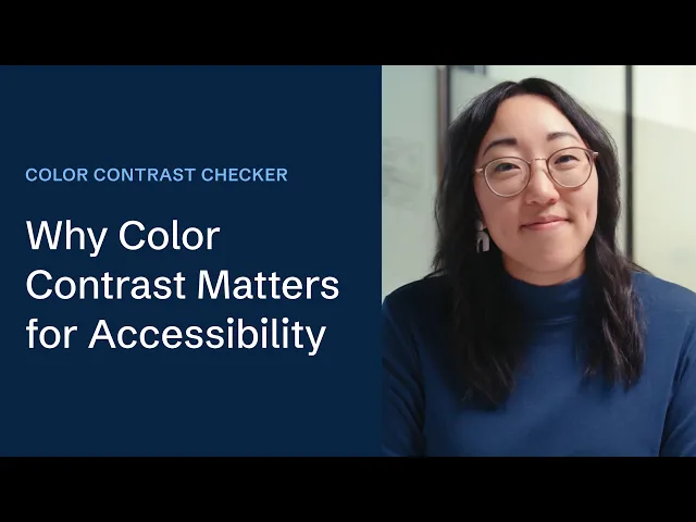
After launch we contracted a professor at The Modern College of Design in Ohio for outside perspective from design education. She told us color contrast wasn't part of her curriculum at all. After working with us, she incorporated it into her course and encouraged students to use the tool directly and send feedback.
The standard also turned inward. I rebuilt AudioEye's own color system around it, with a documented process so every designer who comes after me can make confident color decisions without having to ask.
Key takeaway
A tool that scores compliance without explaining it just moves the confusion downstream. Building the explanation into the tool is what turned it from something designers check into something they learn from.
The team
Sr. Brand Manager & UX Strategist | Sojin Rank |
Visual Designer | |
Web Developer |